The Journal

Letterforms & Measurements 1.0

letterforms_and_measurements

As I mentioned in an earlier post, according to one of the books I read on Arabic type, I have to design the letters (ع ا س) to figure out the letter forms and the measurements such as ascenders, descenders, loop height, and loop height. The image above is a hand drawn letters, they are still not done digitally using any software. I am still figuring out the letterforms and the measurements, but I think I like what I've done so far. Before moving to design more letter forms, I am going to try softening the angles and make them more rounded. 

In addition, as I develop this research further, I am going to include more Arabic terms and explanations. This is because I found out that because most of the books on related subjects are written in English, which is creating another layer of challenge for anyone whom native language is not English.  I am getting those Arabic terms from the book I've read so far.

If you are reading this, I'd very much like to get your feedback on what I've reached so far. Thank you!

Typographia Polyglotta

typographia_polyglotta
In the interest of communicating effectively and well, we are pleased to present Typographia Polyglotta. This book is a tool to help those who want to set type in different script and language forms to do it with greater ease. It is also a device for imagining: consider how much we can do with a laptop with a polyglot set of fonts on it, safe in the knowledge that the expression of our ideas and visions can reach anyone at any time
— Mark Batty

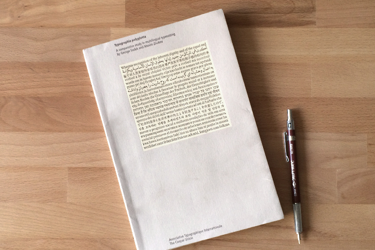
When I was attending TypeCon14, I came across this small book called Typographia Polyglotta by George Sadek and Maxim Zhukov. It was undergoing the silent auction that was organized as part of the conference. Too bad, I couldn't win the bid, but I ordered it right after I got back home. The first edition of this book was published in 1991. It was a research project of the Herb Lubalin Study Center of Design and Typography at Cooper Union. The study is basically a comparative study in multilingual typesetting. The first edition of this book was concieved and esigned by George Sadek, and Frank Stanton. The book was republished by AtypI in 1997.

The authors basically took a sample text from the preamble to the Universal Declaration of Human Rights which is originally in English, and used its official translation to compare and contrast the typesetting between 22 different languages: English, Arabic, Chinese, Czech, Dutch, Esperanto, Farsi, Finnish, French, German, Hebrew, Hindi, Hungarian, Italian, Japanese, Korean, Portuguese, Russian, Spanish, Swahili, and Swedish. On the spread, you would see that passage typesetting on right side, and informational page about the language characteristics, and its typesetting on the left page. 

I learned quite a bit from this read. First, At least for me, I think that it made me sure that learning by comparison is a good approach. In addition, I learned that the system of the language typesetting could affect the color/texture of the text a lot. Moreover, It was mentioned in the book that if someone is working on a bilingual design, its always better to start designing with the the language that has less fonts resources. I also learned that If we get the same text in English and translate it into Arabic, chances are that the text in Arabic will be relatively a bit shorter than the English.

This is too personal, but I always loved the Italian language, and I think that its the most beautiful spoken language. The following quote from the book made my day:

Our experiment proves Italian to be indisputably the ‘best-looking’ language of all those that were tested using latin script.

After reading this small book, I felt that there is a connection between this project, and Google Noto Fonts, which I will do further research on it in a later stage. 

Alif as Ascender

Aleph.jpg

Alif is the first letter of the Arabic alphabets. The origin of the Arabic letter Alif comes originally from Aleph, which is the west semitic word for "ox". Speaking of "ox", I've recently got this book called: A is for Ox: a Short History of the Alphabet. It is a nice small book that has a good amount of information on the history and evolvement of these letterforms.

Back to the letter Alif which is one of few Arabic letters that comes only in two forms. The isolated form (ا) looks similar to the initial form, and the middle form (ـا) looks similar to the medial form. It is on of the letters that could define the ascenders height. 

In the image above, there are four letters. From right to left, the letterforms are the following: 

  • Initial/isolated Alif
  • Initial Ayin 
  • Final/medial Alif
  • Isolated Ayin

By drawing those letterforms, the ascender, the loop height, and the descenders are set, but, they might change as I develop more letter forms. Moreover, there is a chance to have more than a loop height, and another shorter descender guide line. I like what I see so far. The typeface does look modern with its open counters. It has a bit of a calligraphic/gothic look and feel too. I think that the letter forms have a lot of character and they are not generic. 

Next step will be defining the tooth height, or maybe more than one height. Lets see how it goes. 

Again, if you are reading this and have any feedback, please shoot me with it!

The First Letterform

thefirstletterform.jpg

I've been working for few days on designing the letter "Ayin" which is (ع) and it means Eye in Arabic. There is another letter that looks and written/drawn exactly like the letter Ayin but with a diacritic dot "Nuqta" above it, forming the letter "Ghyin" which is (غ). 

The thing about Arabic letters that they come in 4 different forms depending on their placement in the word: 

  1. Isolated form
  2. Initial form
  3. medial form
  4. final (ending) form

Its helpful to mention that in some occasions, the final, and the medial form could look completely different than the other forms. 

As for the letterform, I am trying to simplify its strokes. As I mentioned in an earlier post, I don't want the typeface to look too calligraphic. It might not look very modern and geometric though. So, I am trying to have the letterforms more geometric and modern but with a hint of calligraphic style. The counters are spacious. The contrast between the the thins and thicks is not great. Moreover, the descender is not much longer than the loop height.

On the right side of the image above is the current letterform of the isolated, and initial form of the Ayin. I am going to stick to it for now, but I am sure it will go through lots of changes as I go. 

A very critical point I learned, is that the letterform can not be judged on its own. It has to be put next to another letters so you can see how the whole thing is going together. This is what I am going to do next; designing more letters!

Feedback is valuable! Please give some.

First sketches

firsts_ketches.jpg

I've been away for a while. School started and I was out of town for few days. During that time, I was reading a book called Lettering & Type by Bruce Willen and Nolen Strals. Its a small book, simple, and practical in its approach. It tackles three main aspects: lettering, designing type, and designing with type. I am about to finish it. I will write another poster about it once I am done. 

As for my typeface designing process. I started sketching the letter (ع) and I am facing some difficulties. One of the main challenges is that I am planing to design a modern typeface and I don't want to make it too calligraphic. So, when I picked Ijazah or Tawqi calligraphic script as a reference/inspiration, it created more challenges. Because of its very organic flow and nature, its making it harder to simplify it into a modern corporate type face. The original script has a great contrast between the thick and thins and I am planing to minimizing that. 

A very good exercise I learned in Type@Cooper Condensed program is to sketch the skeleton of the letterforms first, and then using different kind of brushes and pens to draw the letter forms based on that skeleton. There are multiple factors that could play a huge role in defining that final letter forms and the contrast between the thick and thins:

  • The tool you are using to draw/write to letterform.
  • The angle and the thickness of that tool.
  • The length of the ascenders, descenders, and their relationship to the x-height, loop height and the tooth heights.
  • The speed and the pace of writing/drawing the letter forms could make a great deal of influence too.

So I am trying to apply different tools to the original skeleton of the letter to get the initial wanted look and feel of the letterforms. 

Interesting: The common understanding of the signature (Tawqi in Arabic) is that its something written or drawn quickly. Yet, the Arabic script (Tawqi) is carefully drawn and astonishing when it comes to aesthetics.