The Journal

New Choices & Decisions

New_Decisions.jpg

It has been a while since I published my last post. I've been busy with school, and other stuff. I have one more semester to go and the thesis project is consuming a lot of time! 

Also, as part of my research, I met Arabic calligraphers, type designers, teachers, and producers. I had wonderful talks, and benefited a lot from discussing my project with them. Also, I visited University of Reading in UK to meet Fiona Ross, and to check out their typography programs. They have a short course that is conducted in the summer. Also, they have another two programs; MA Typeface Design and MRes Typeface Design. I am actually considering registering for the short course during the summer! The great thing about this program is the fact that the teachers have expertise in designing Non-Latin type, including Arabic which will help me in my project!

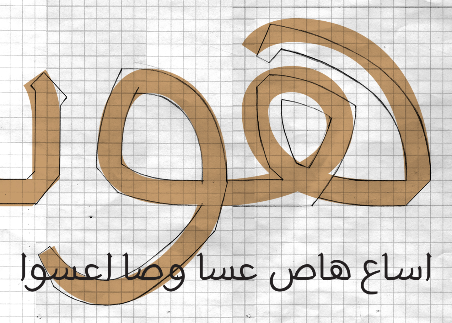
Now back to the typeface I am designing. It was a good exercise to leave the sketches for a while and getting back to them after a while. Now that I am working on designing the letterforms again, I made new decisions, and choices. So, I thought that the letterforms I designed previously were a bit rigid. For some reason, those angles did not look OK to me. As a result, I decided to make keep the same skeleton of the letterforms, but soften the angles. I definitely like the new forms more! I still have to work on the kerning, and proportions more though.

The image above shows the old angler sketches, and the new approach overlaying them. I produced some isolated, initial, and medial forms. So far, the letterforms do not have much contrast between the thicks and thins. They are more likely to be mono weight, except for some tips, and endings of the strokes. 

One more thing.. 

I think that this is going to end up being a "thin" weight of the typeface. I am saying that because when I compared it to another typefaces, it only matched the thin weight, but I will keep working on it as is anyways. 

Thoughts? feedback? Please do share them!

Fa’ & Qaf

fa_and_qaf

I've been away for a while. I was not lazy, but I was overloaded with school work and freelance projects. Actually, I've been working on the letters Fā’ & Qāf since my last post. It was tricky. Because the way I decided to design the initial Fā’ & Qāf and the isolated/terminal Fā’ without the Nuqta ended up almost being as high as the Alif which is problematic. So, a decision had to be made and I redesigned the Alif to be a bit taller as you can see above, on the left Alif. 

This time, after doing many sketches, and scan them, I decided to digitize these letters using GlyphsApp which is an application for designing type. I learned how to use recently. I used to Robofont for Latin/Roman type design but never used it for Arabic. To be honest, when I compared both applications, Glyphs was much easier and intuitive. In addition, it makes life much easier when it comes to design Non-Latin type. I still did not dig deep in Glyphs but from the basics I learned, it seems promising.

Fa_and_qaf_II.jpg

Back to the letterforms.. 

I am also testing different kind of Nuqta. I experienced something while designing the isolated Fā’. Initially, I intended to have it sits straight on the baseline, but, it looked weird. So, I decided to have a little overshoot lower than the baseline which made it more natural and fluid. Also, I had to make the bowl of the Qāf a bit wider than the Sin because of needle eye/loop. I've already worked on the Waw letter but haven't had the chance to digitize it yet.  

Tough One

Ha_pattern

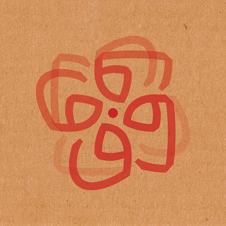
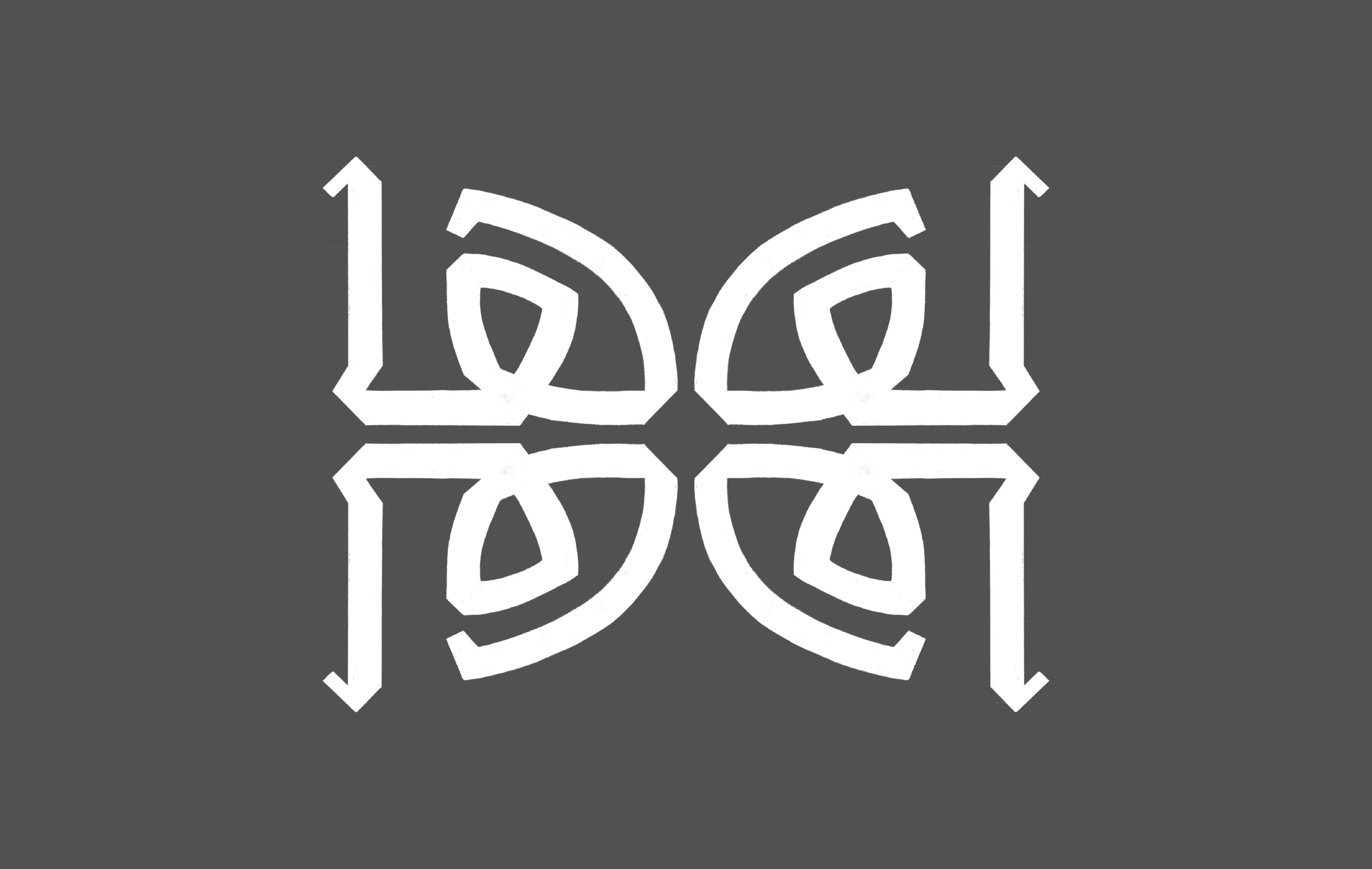
This one was tough. The letter  took a while till it was shaped in this form. I struggled with fluidity of the stroke movement. Well, the letter Hā - in my opinion - is one of the most beautiful Arabic letters because of its unique form. I had to set a new guide line, which is another loop height for this letter. I am not sure if this loop height well be applied to more letters. I might reduce the height of the letter, but not sure yet. I will be sure once I have a bigger set of letter forms. I am trying to use the modular approach to design some of the letter forms, but I end up starting from there, then tweak the lines here and there to form the new letter.  

ha_and_more.jpg

I am placing the letters next teach other in different context to see if there is harmony between them. So far, I don't feel that any of the letters looks odd in comparison to the rest. I think that I have to design some middle forms very soon. 

Note: For non Arabic speakers/readers, the first image is not the letter form. It is the letter Hā repeated four times to form a pattern. Yes, I am just playing around. 

Letterforms & Measurements 1.0

letterforms_and_measurements

As I mentioned in an earlier post, according to one of the books I read on Arabic type, I have to design the letters (ع ا س) to figure out the letter forms and the measurements such as ascenders, descenders, loop height, and loop height. The image above is a hand drawn letters, they are still not done digitally using any software. I am still figuring out the letterforms and the measurements, but I think I like what I've done so far. Before moving to design more letter forms, I am going to try softening the angles and make them more rounded. 

In addition, as I develop this research further, I am going to include more Arabic terms and explanations. This is because I found out that because most of the books on related subjects are written in English, which is creating another layer of challenge for anyone whom native language is not English.  I am getting those Arabic terms from the book I've read so far.

If you are reading this, I'd very much like to get your feedback on what I've reached so far. Thank you!

Alif as Ascender

Aleph.jpg

Alif is the first letter of the Arabic alphabets. The origin of the Arabic letter Alif comes originally from Aleph, which is the west semitic word for "ox". Speaking of "ox", I've recently got this book called: A is for Ox: a Short History of the Alphabet. It is a nice small book that has a good amount of information on the history and evolvement of these letterforms.

Back to the letter Alif which is one of few Arabic letters that comes only in two forms. The isolated form (ا) looks similar to the initial form, and the middle form (ـا) looks similar to the medial form. It is on of the letters that could define the ascenders height. 

In the image above, there are four letters. From right to left, the letterforms are the following: 

  • Initial/isolated Alif
  • Initial Ayin 
  • Final/medial Alif
  • Isolated Ayin

By drawing those letterforms, the ascender, the loop height, and the descenders are set, but, they might change as I develop more letter forms. Moreover, there is a chance to have more than a loop height, and another shorter descender guide line. I like what I see so far. The typeface does look modern with its open counters. It has a bit of a calligraphic/gothic look and feel too. I think that the letter forms have a lot of character and they are not generic. 

Next step will be defining the tooth height, or maybe more than one height. Lets see how it goes. 

Again, if you are reading this and have any feedback, please shoot me with it!