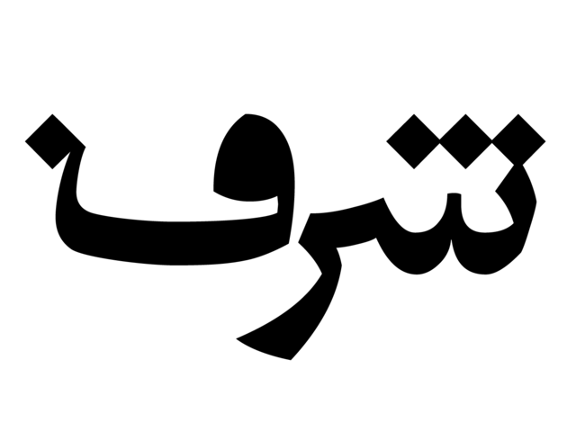
I've been working for few days on designing the letter "Ayin" which is (ع) and it means Eye in Arabic. There is another letter that looks and written/drawn exactly like the letter Ayin but with a diacritic dot "Nuqta" above it, forming the letter "Ghyin" which is (غ).
The thing about Arabic letters that they come in 4 different forms depending on their placement in the word:
- Isolated form
- Initial form
- medial form
- final (ending) form
Its helpful to mention that in some occasions, the final, and the medial form could look completely different than the other forms.
As for the letterform, I am trying to simplify its strokes. As I mentioned in an earlier post, I don't want the typeface to look too calligraphic. It might not look very modern and geometric though. So, I am trying to have the letterforms more geometric and modern but with a hint of calligraphic style. The counters are spacious. The contrast between the the thins and thicks is not great. Moreover, the descender is not much longer than the loop height.
On the right side of the image above is the current letterform of the isolated, and initial form of the Ayin. I am going to stick to it for now, but I am sure it will go through lots of changes as I go.
A very critical point I learned, is that the letterform can not be judged on its own. It has to be put next to another letters so you can see how the whole thing is going together. This is what I am going to do next; designing more letters!
Feedback is valuable! Please give some.

