The Journal

Arabic Typography Bookshelf

Books.jpg

Part of my research was to look for books on designing with Arabic type, or designing Arabic type. Well, as expected, the books in the image above are almost all the books available on the subject, maybe couple more. In addition, maybe there are few more but they are not written in English, nor Arabic. 

In all cases, this research was interesting. One finding is that there are not many of them, comparing to the books on Latin/Roman typography and type design. In addition, the 12 books above cost more than $800, excluding the cost of delivery/shipping. So, the average price for a book on Arabic typography is almost $70, which is expensive. Just for the sake of comparing prices, I went to Amazon.com and searched for books on Latin/Roman typography and calculated the accumulated price of 50 books, and the total was $740, which means that the book average price is about $26. So, the problem is not only the lack of resources on Arabic type, its also the fact that they are expensive!

Anyways, in the list below are you can find the books I found on Arabic typography, as they are numbered in the image above. If you are interested in buying any of them, just click on the title: 

  1. Sculpting Type
  2. Arabic Type Design for Beginners
  3. Arabic Font Specimen Book 
  4. Typographic Matchmaking in the City
  5. Typography Matchmaking
  6. Arabic Typography
  7. Arabesque 1
  8. Arabesque 2
  9. Writing Arabic
  10. Talking About Arabic
  11. Cultural Connectives
  12. Arabic for Designers

If you know more books that you would like to add to the list, please let me know! I am looking for more resources!

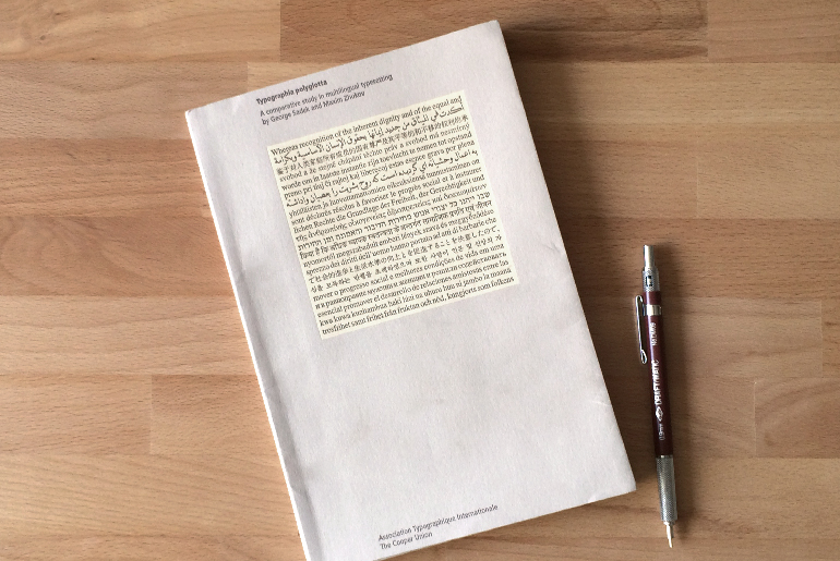
Typographia Polyglotta

typographia_polyglotta
In the interest of communicating effectively and well, we are pleased to present Typographia Polyglotta. This book is a tool to help those who want to set type in different script and language forms to do it with greater ease. It is also a device for imagining: consider how much we can do with a laptop with a polyglot set of fonts on it, safe in the knowledge that the expression of our ideas and visions can reach anyone at any time
— Mark Batty

When I was attending TypeCon14, I came across this small book called Typographia Polyglotta by George Sadek and Maxim Zhukov. It was undergoing the silent auction that was organized as part of the conference. Too bad, I couldn't win the bid, but I ordered it right after I got back home. The first edition of this book was published in 1991. It was a research project of the Herb Lubalin Study Center of Design and Typography at Cooper Union. The study is basically a comparative study in multilingual typesetting. The first edition of this book was concieved and esigned by George Sadek, and Frank Stanton. The book was republished by AtypI in 1997.

The authors basically took a sample text from the preamble to the Universal Declaration of Human Rights which is originally in English, and used its official translation to compare and contrast the typesetting between 22 different languages: English, Arabic, Chinese, Czech, Dutch, Esperanto, Farsi, Finnish, French, German, Hebrew, Hindi, Hungarian, Italian, Japanese, Korean, Portuguese, Russian, Spanish, Swahili, and Swedish. On the spread, you would see that passage typesetting on right side, and informational page about the language characteristics, and its typesetting on the left page. 

I learned quite a bit from this read. First, At least for me, I think that it made me sure that learning by comparison is a good approach. In addition, I learned that the system of the language typesetting could affect the color/texture of the text a lot. Moreover, It was mentioned in the book that if someone is working on a bilingual design, its always better to start designing with the the language that has less fonts resources. I also learned that If we get the same text in English and translate it into Arabic, chances are that the text in Arabic will be relatively a bit shorter than the English.

This is too personal, but I always loved the Italian language, and I think that its the most beautiful spoken language. The following quote from the book made my day:

Our experiment proves Italian to be indisputably the ‘best-looking’ language of all those that were tested using latin script.

After reading this small book, I felt that there is a connection between this project, and Google Noto Fonts, which I will do further research on it in a later stage. 

Decision made

Ijazah.jpg

I decided what I want to do with the typeface I am going to work on. I am still confused if I should use the word typeface or font. Some one guide me into this please! Its going to to be a headline typeface. It will be modern and conventional. I will draw the letterforms based on the old Arabic calligraphic style: Ijazah or Tawqi' which was developed at the time of the Abassids dynasty. The Tawqi script was used in official signatures scripts. For non Arabic speakers, Tawqi' means signature, and Ijazah means certification. Ijazah/Tawqi' is also known for connecting the final letter of the word to the initial letter of the following word. It was often used for official documents and important references. I always loved this script because of pen flow while writing it. Its not very common as the rest of the main Arabic calligraphic scripts. Its a combination between Naskh and Thuluth which gives it great proportions. I will not design a revival of the script. I will only design the letter forms based on it.

three_letters.jpg

I learned that if I am designing a Roman typeface, I should start by designing the letterforms of the capitals H and O then the lowercase l,n,o, and to get the sense of proportions of the ascenders, descenders, x-height, capital, contrast, and letters width. For Arabic, I learned that I should start with the letters (ع ا س) to get the sense of the ascenders, descenders, loop and tooth heights, contrast, and letters width. So, there is nothing such as x-height in Arabic typefaces. In some Arabic typefaces, there are 2 loop heights. Sometimes, the loop and the tooth heights are the same.

I think, that the typeface I will be working on will end up being a mixture of my handwriting and Ijazah script letter forms skeletons.


Tiraz

Me and my friends visited the Metropolitan Museum of Art here in New York. We visited the Islamic section there. I remember that I saw few interesting letterforms and calligraphic styles, and they were a bit unusual to my eyes. 

Post5_1.jpg
Post5_2.jpg

So, after I did some readings yesterday, I thought I should take a break and go the the Met again. I went back to the Islamic section, and I found those interesting letterforms and inscriptions. They were inspirited textiles that all called Tiraz which comes from the Persian word for "embroidery." The one that were exhibited come from Iraq. I might use the letterforms as a base for the typeface I will be designing, but not very sure. I thought I should keep them in the journal anyways.