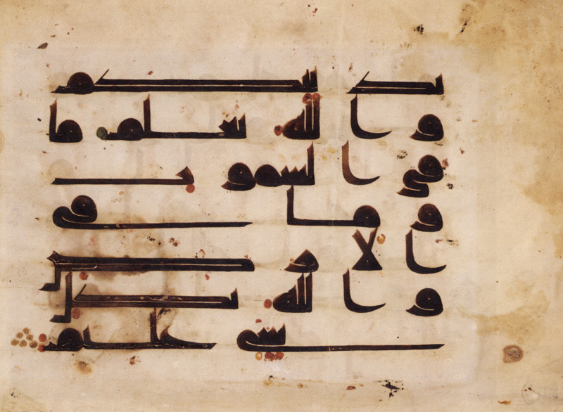
For a while, I was wondering if I should start with designing a calligraphic (maybe Nasekh) based type face or Kufic. I was reading an interview with Pascal Zoghbi and found this sentence:
“For young Arabic typographers and non-Arab typographers, the Kufi will be the first choice to start understanding the Arabic script.
In the 21st century and Kufi script is making a big come back. Even though Kufi is one of the oldest Arabic calligraphic styles, the geometric construction of its letterforms and the low-contrast (or mono-linear) pen stoke makes it ideal for creating modern Arabic typefaces. There are several contemporary Arabic fonts in the market nowadays based on the kufi style. In brief, most of the Arabic calligraphic styles are high contrast unless the Kufi style. If compared to the Latin typefaces again, high contrast Arabic typefaces will be compared to classical serif Latin typefaces, while low contrast Arabic typefaces will be compared to Sans serif Latin typefaces.”

